Project Overview
This project covered a complete brand design, website design and development. We branded and built the website to align with the institution’s identity. The goal was to create a modern, user-friendly platform with improved aesthetics, functionality, and engagement. It included redesigning the logo, updating brand colors and typography, and refining the overall visual identity. The result was a visually cohesive brand and an optimized digital experience.
Scope
Branding:
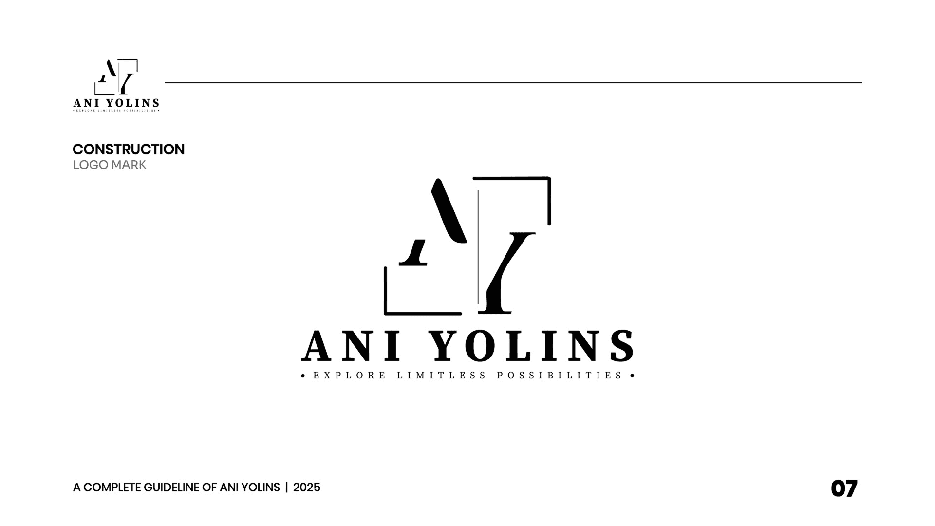
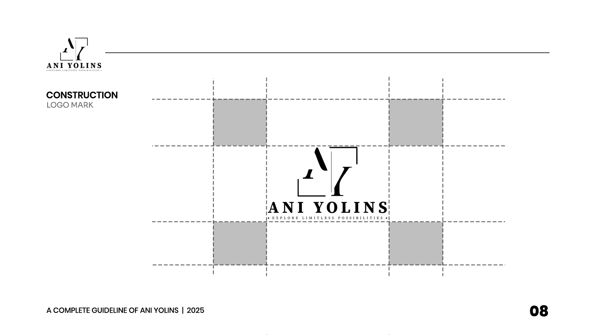
- Refreshed visual identity, including a redesigned logo, updated typography, and cohesive color scheme..
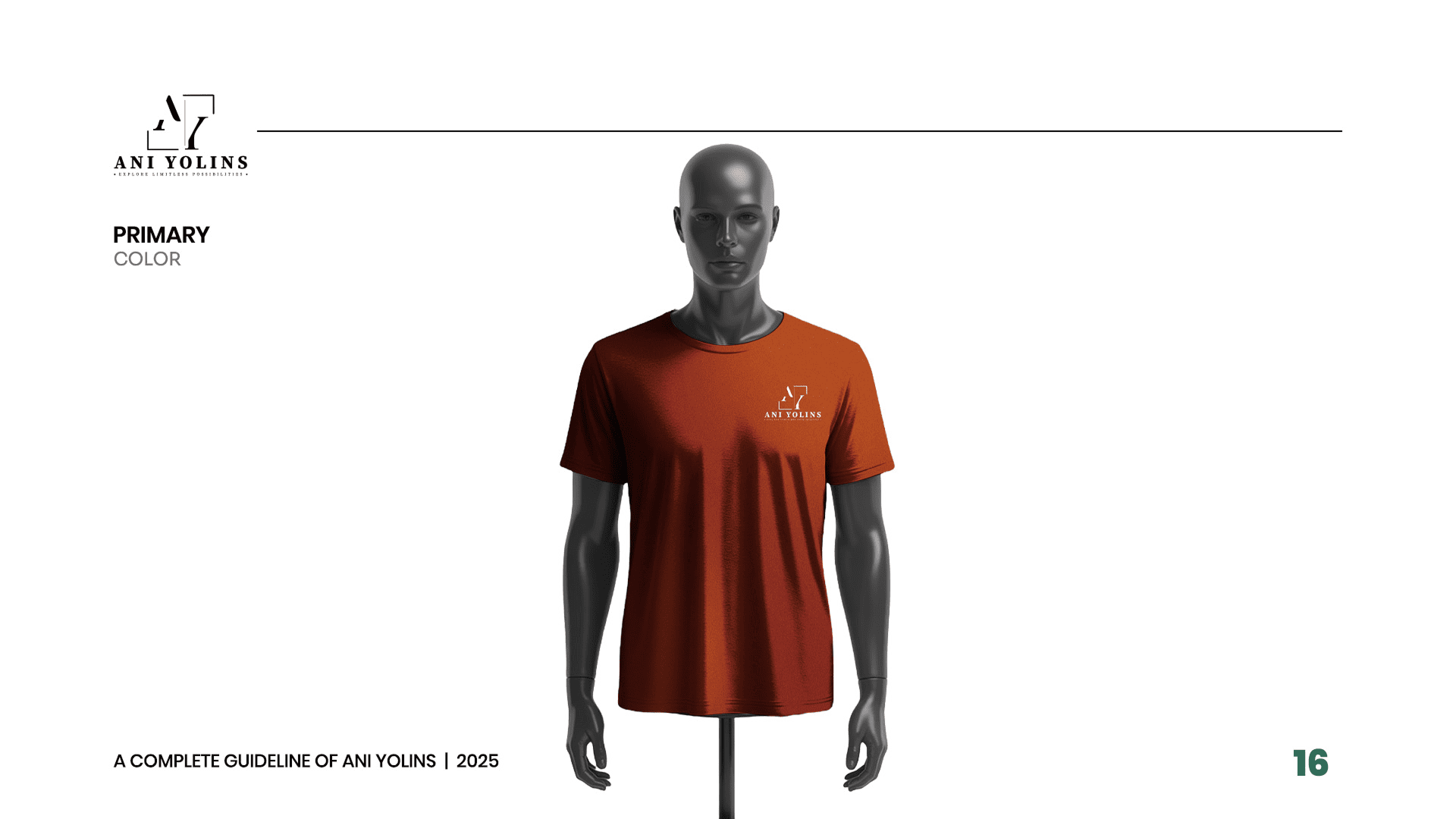
- Created a consistent branding system for both digital and print materials..
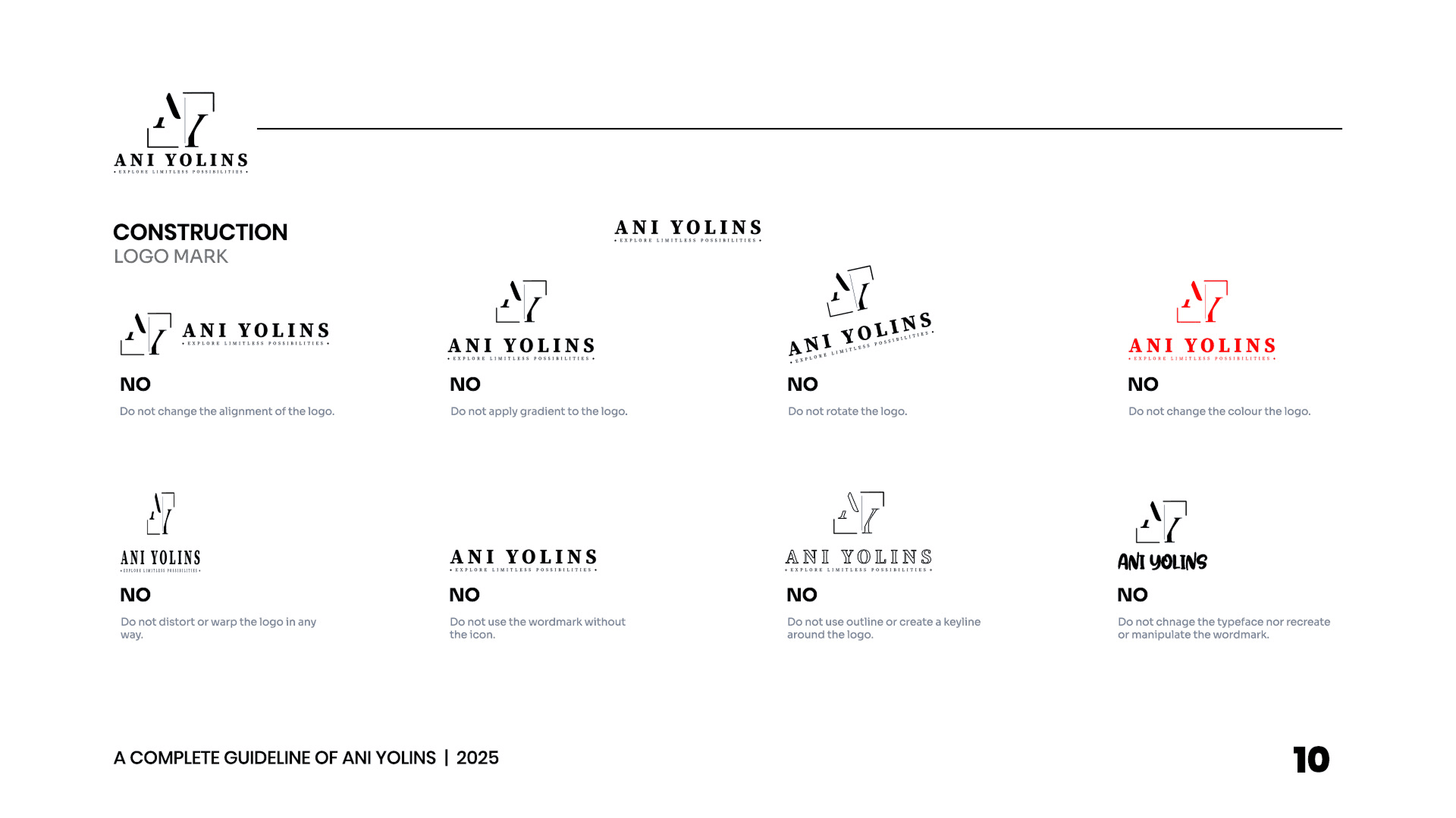
- Delivered brand guidelines to ensure future consistency across all platforms…
UI/UX Design and Web Design
- Created wire-frames and interactive prototypes for an intuitive user experience.
- Focused on optimizing ease of navigation and interaction for all users..
- Designed with mobile-first principles to ensure seamless usability across devices.
- Developed a modern, fully responsive website to enhance accessibility and performance.
- Streamlined site structure for improved navigation and faster load times.
- Ensured cross-browser compatibility and optimal display on various screen sizes.
Pain Point
The project faced challenges with outdated branding, a disjointed user experience, and an inefficient website design. The branding no longer aligned with the company’s vision, creating confusion for the audience. The website had complex navigation, slow load times, and was not mobile-optimized, leading to user frustration. Inconsistent visuals and messaging further weakened the brand’s presence, resulting in low engagement, high bounce rates, and missed conversion opportunities.
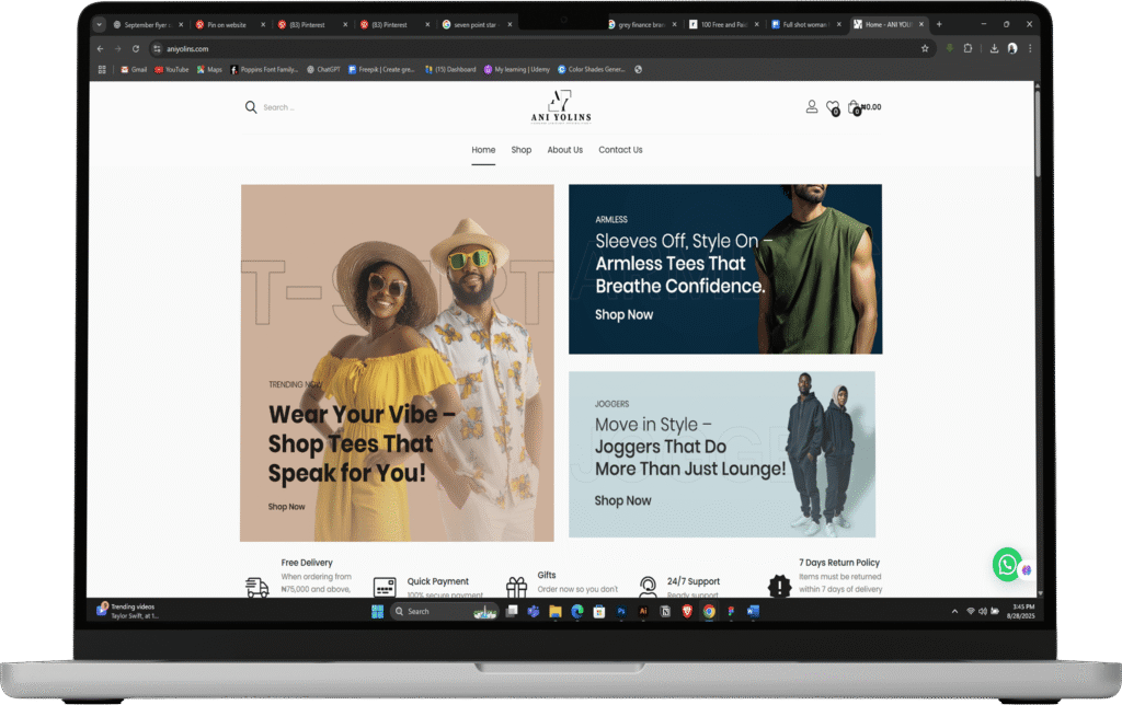
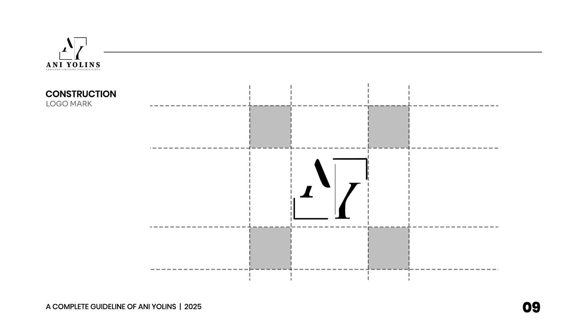
Branding
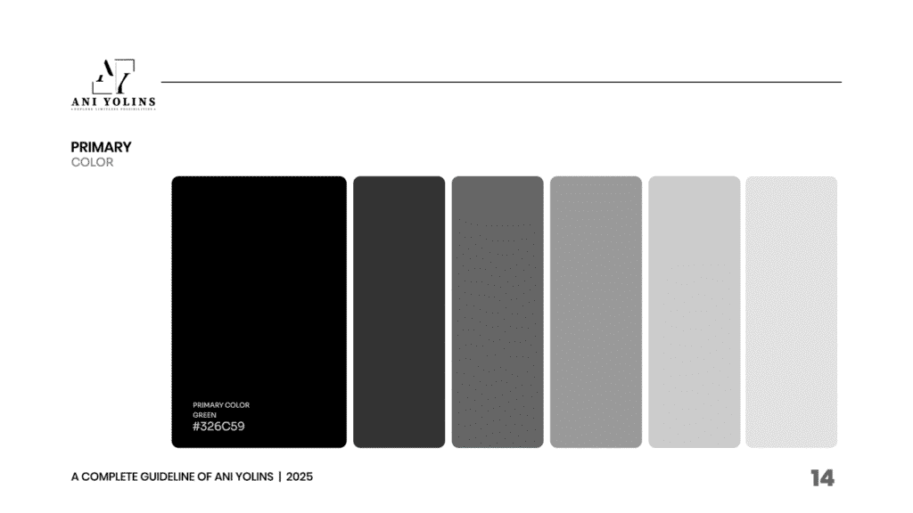
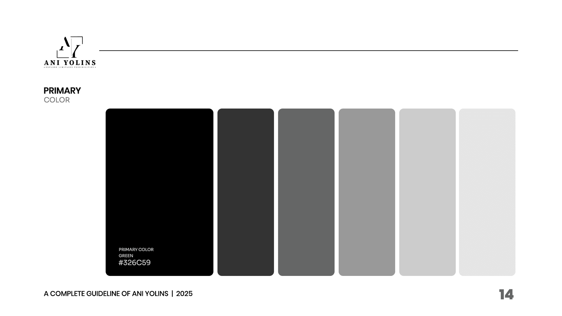
Colour
For the branding, we focused on developing a refreshed visual identity that resonates with the company’s modern vision. The new color palette features:
-
- Black (#000000) – composed of 0% red, 0% green and 0% blue. It is associated with a variety of emotions and concepts, such as power, sophistication, elegance, mystery, strength, formality, and depth.
- White (#FFFFFF) – The #FFF is a shorthand for the full hex code #FFFFFF, which is a combination of the maximum intensity of red, green, and blue light, resulting in the color white.
This combination of colors creates a cohesive, modern look that is both professional and inviting, supporting the company’s refreshed identity across all digital and print platforms.
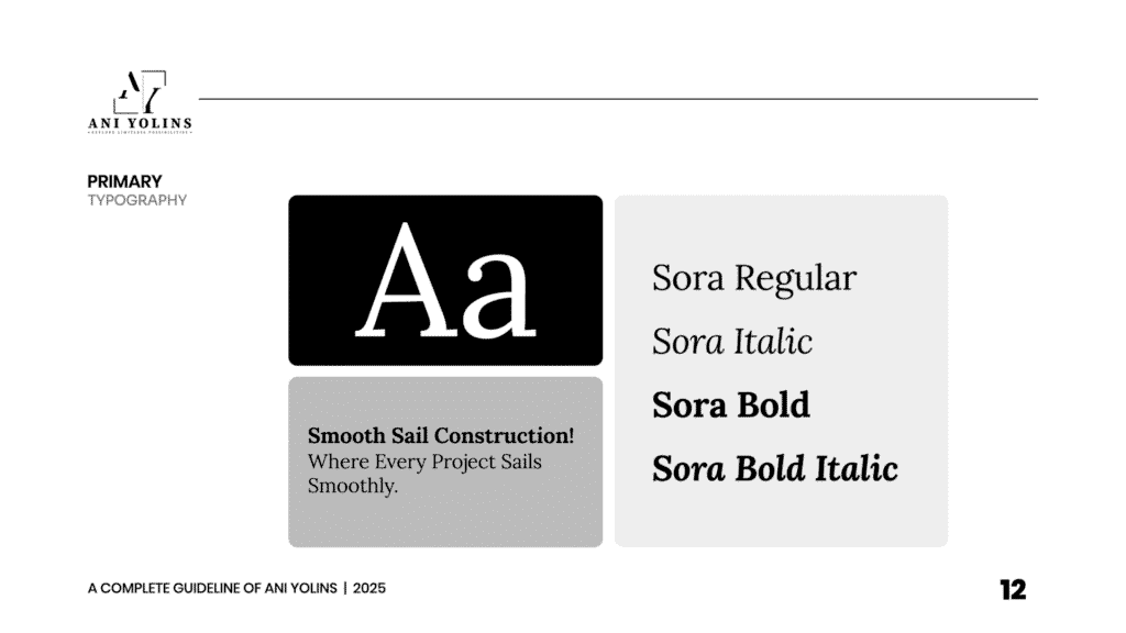
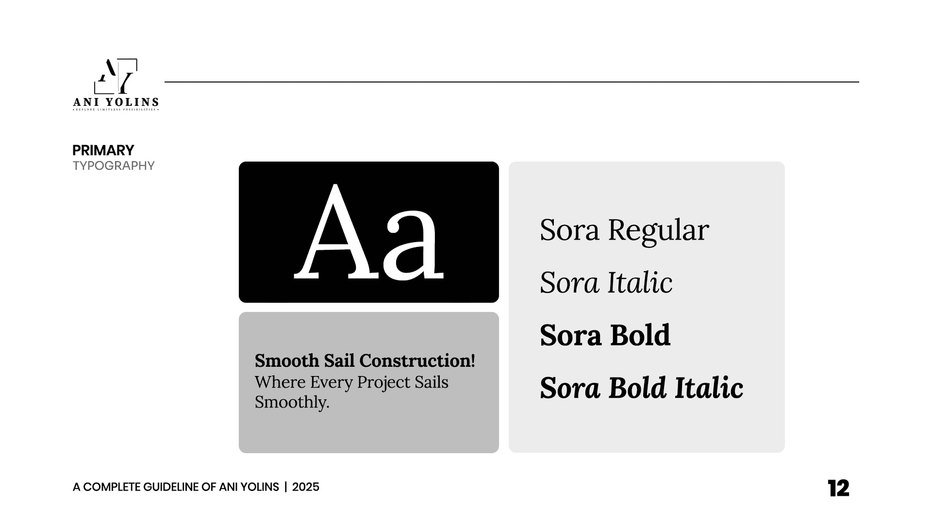
Typography
Carefully selected a font that complement the brand’s personality while ensuring clarity and accessibility.
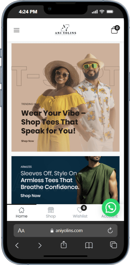
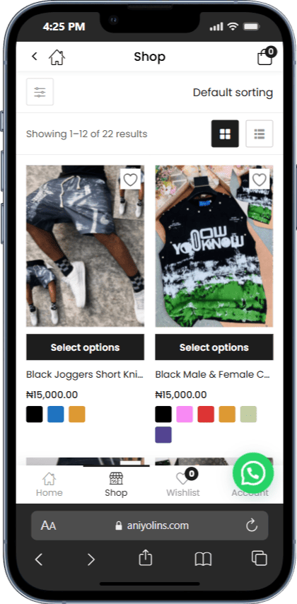
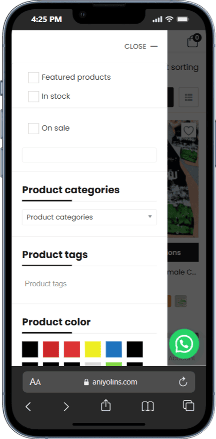
UI/UX Design and Web Design
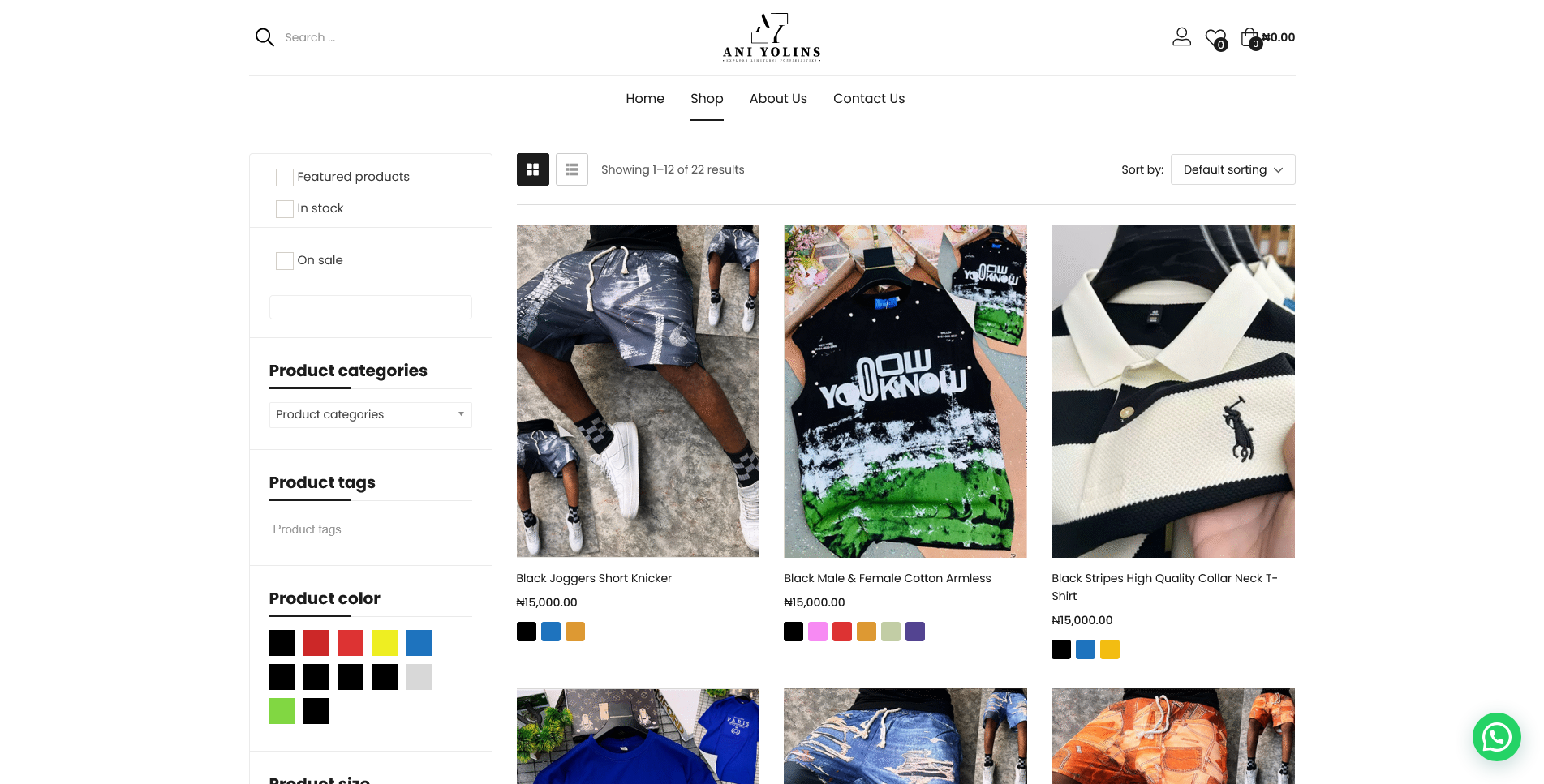
UI/UX Design
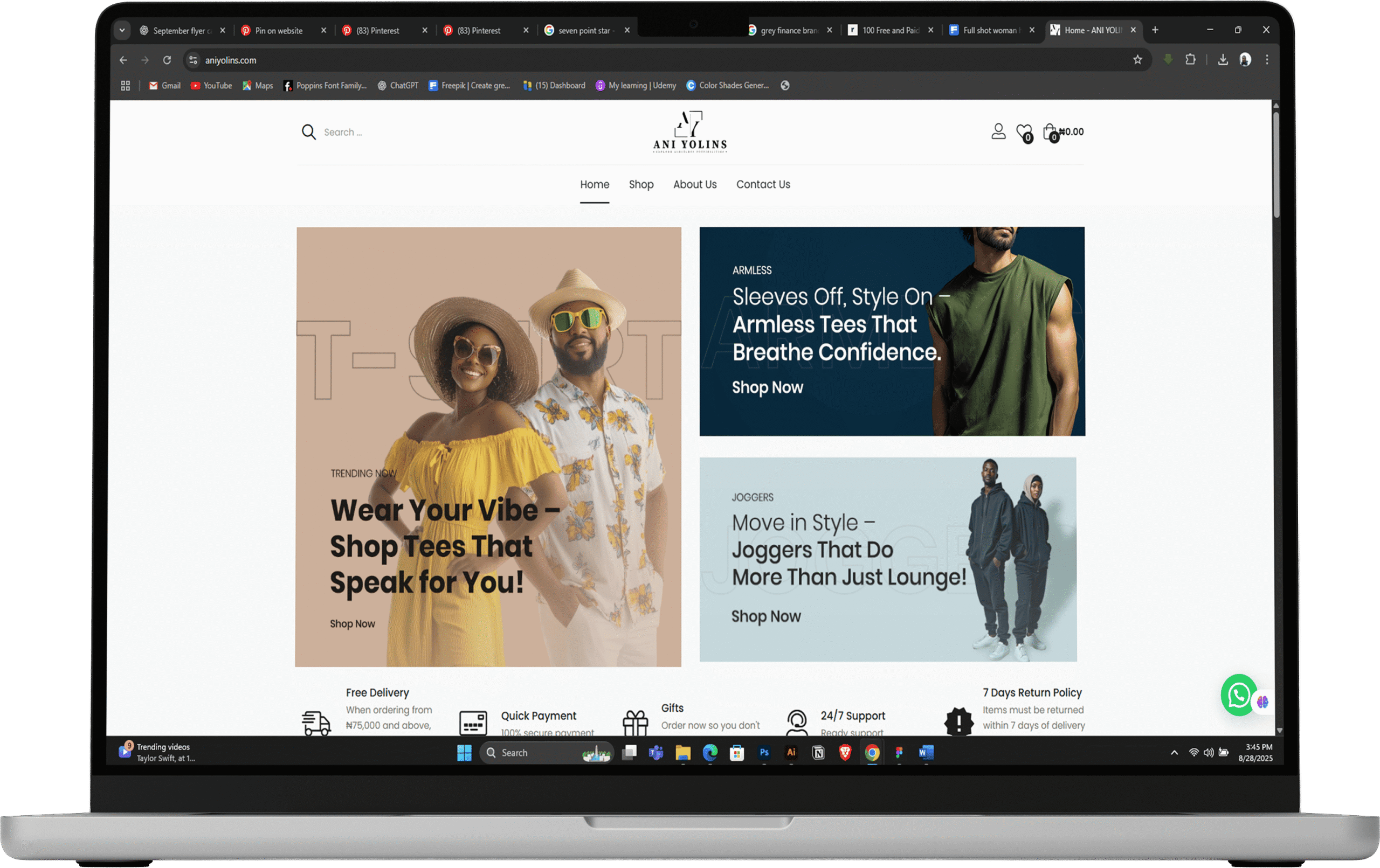
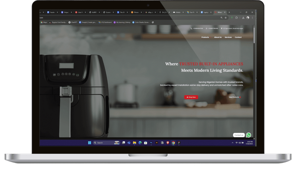
The UI/UX design focused on creating an intuitive, user-centered experience. By crafting wire-frames and prototypes, we ensured smooth navigation and ease of use across all devices. The mobile-first design prioritizes fast load times, clear calls to action, and seamless interaction, enhancing user satisfaction and engagement.
Web Design
The website redesign delivers a modern, responsive platform optimized for speed and performance. The clean, intuitive layout improves navigation and accessibility, while mobile responsiveness ensures a smooth experience on any device. The design aligns with the new brand identity, creating a cohesive and engaging online presence.
