WNL Power Solutions Website and Brand Guideline Redesign
Web Design, UI/UX Design
Project Overview
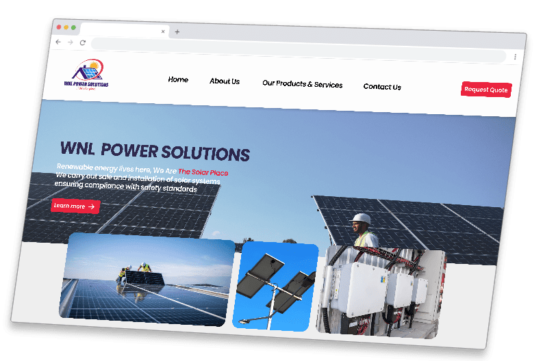
WNL Power Solutions’ website was not effectively meeting the needs of its users. The site’s navigation was complex, making it hard for customers to find relevant product details and educational content. Many users struggled to understand the benefits of solar energy, and the lack of clear calls to action made it difficult to convert visitors into leads. The website’s poor mobile experience further contributed to user frustration, leading to decreased engagement and low conversion rates. These issues were impacting the company’s ability to attract and convert new customers.
Goals
Website Redesign:
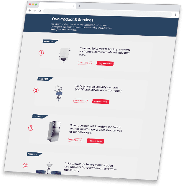
A clear, streamlined menu structure that categorizes services (residential, commercial, installation, etc.).
A clean, modern design that reflects the eco-friendly brand of WNL Power Solutions.
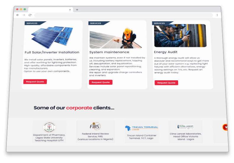
Detailed product descriptions with specifications, pricing, and benefits.
Brand Guide:
Development of a new visual identity, including color palette and typography
Consistent branding across all digital platforms, aligning with the company’s mission and target audience.
High-quality, bright, and vibrant images reflecting the use of solar energy, nature, and sustainability.
The site should be fully optimized for mobile, ensuring users have a smooth experience across devices.
Pain Point 1
The website’s navigation is cluttered, making it challenging for users to find the information they need, such as solar product details, pricing, or the consultation booking process.
Pain Point 2
The outdated or inconsistent design doesn’t reflect the modern, cutting-edge nature of solar technology, which can lead to an impression of unprofessionalism or lack of attention to detail.
Color Palette
Color
Our brand identity is built on a bold and modern two-color palette that reflects professionalism, trust, and energy. Each color plays a distinct role in shaping our visual identity
Primary Color – Navy blue (#294462)
This color conveys professionalism, trust, and stability, aligning well with your mission and values.
Accent Color – Crimson Red (#EB243F)
A sense of boldness and vitality, professionalism and trustworthiness, creating a balanced, impactful visual identity. This color can be used to highlight key elements like buttons, call-to-action sections, and promotional content
Primary Color
Shades
Secondary Colour
Shades
Typography
UI/UX Design and Web Design
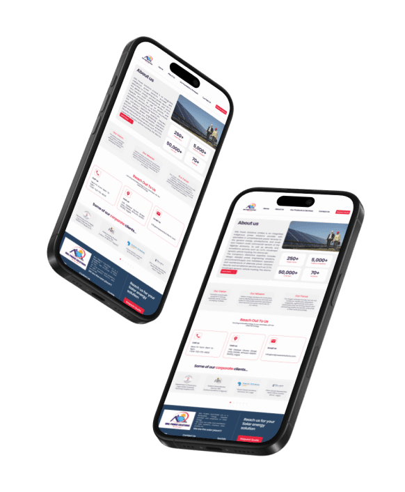
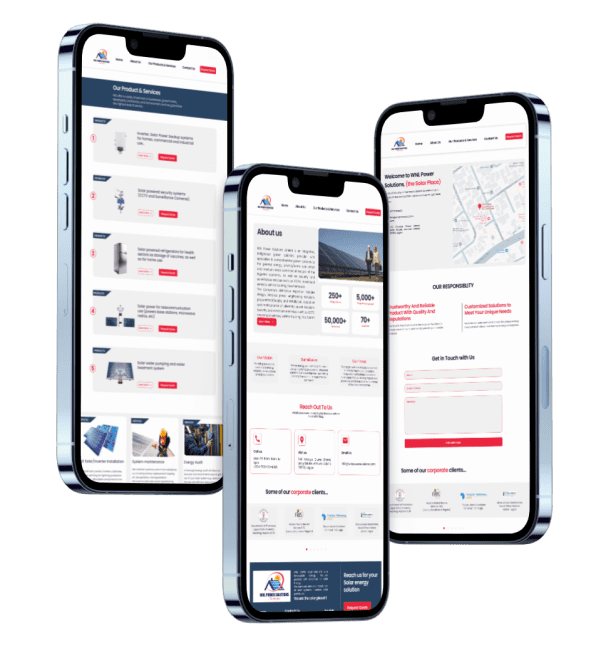
UI/UX Design
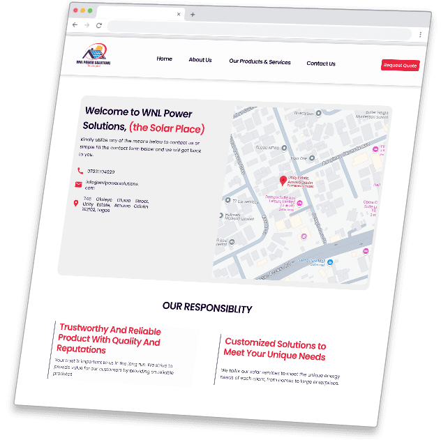
The new design focuses on intuitive navigation, clean layouts, and a modern aesthetic that enhances usability
User-Centric Navigation
A streamlined structure that makes it easy for visitors to find information effortlessly..
Responsive & Accessible
Optimized for all devices, ensuring a seamless experience across desktops, tablets, and smartphones..
Engaging Visuals & Typography
A balanced mix of bold, professional styling with clear, legible fonts for enhanced readability.
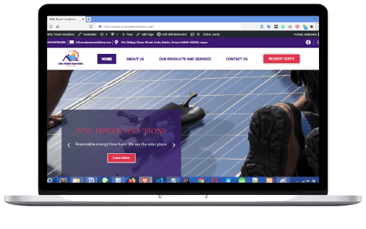
Web Design
Our website redesign focuses on creating a visually appealing, functional, and high-performing digital experience that aligns with our brand identity. The new design is built with usability, aesthetics, and engagement in mind, ensuring that visitors can navigate effortlessly while enjoying a seamless experience.
High-Performance Optimization
Faster load times, smooth animations, and lightweight code for a seamless browsing experience.
SEO-Optimized Structure
Built with best practices in mind to enhance search engine rankings and improve discoverability.


